





Let’s discuss about Aptos New Default Font for Microsoft instead of Calibri. Microsoft is introducing Aptos, their modern successor to Calibri, as the new default font for their software products. After 15 years of faithful service, Calibri, Microsoft’s beloved default font and the cornerstone of office communications, comes to a natural end.
Times have changed, and so have we. The technology we employ daily has evolved, prompting the quest for the perfect font to suit higher-resolution screens. This journey demanded a font with sharpness, uniformity, and exceptional display capabilities.
Microsoft embarked on a mission to find the perfect successor to their beloved Calibri, commissioning five new fonts: Bierstadt, Grandview, Seaford, Skeena, and Tenorite. All five fonts were added to the drop-down font picker, allowing users to use and provide feedback on each of them.
Throughout the process, Microsoft attentively listened to the passionate feedback from their users, aiming to select the font that rolls most with their preferences and needs. Ultimately, Bierstadt emerged as the clear favorite, captivating users with its modern appeal, sharpness, and suitability for higher-resolution screens. However, in the spirit of embracing change, the font formerly known as Bierstadt is now aptly named Aptos.

How Do You Replace Calibri?
Replacing Calibri involves selecting a new default font for Microsoft’s software products. This process typically includes evaluating various font options and considering factors like readability and compatibility with different devices and platforms. After thorough testing and user feedback, Microsoft introduces the chosen font as the new default, thereby replacing Calibri in their software suite.
How Do you Find that One True Font that can Take its Place as the Rightful Default?
Finding the one true font to replace a default like Calibri involves a comprehensive process considering various factors. They are as follows.
1. Typography Experts and Designers
2. User Surveys and Feedback
3. Readability and Legibility
4. Compatibility
5. Display Capabilities
6. International Character Support
Aptos New Default Font for Microsoft Instead of Calibri
Microsoft’s decision to introduce Aptos as the default font gracefully replaced the beloved Calibri. With its sharpness, uniformity, and exceptional display capabilities, Aptos is the perfect choice for higher-resolution screens.
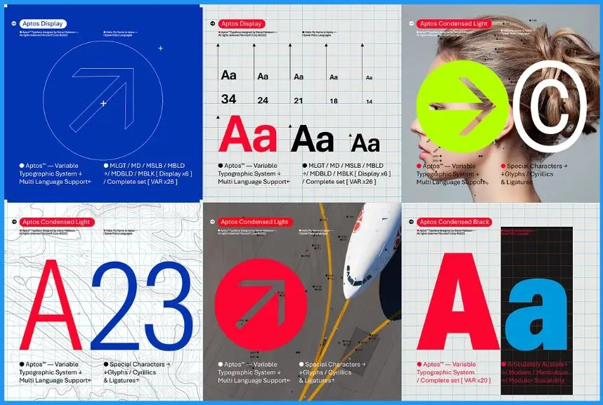
The typeface Aptos was created by Steve Matteson, a renowned type designer known for his previous work on the original Windows TrueType core fonts and Segoe. Originally named Bierstadt, he changed it to Aptos in homage to his favorite unincorporated town in Santa Cruz, California.
- The diverse landscape and climate of Aptos, with its fog, beaches, redwood trees, and mountains, perfectly embody the font’s versatility.
- Steve’s creative process involved drawing the letters by hand, evoking the feeling of returning to pencil and paper and connecting with the outdoors.
- He added warmth to the font, comparing it to preferring a human voice over a GPS voice.
- It is preserving the handmade craftsmanship that gives the font its unique character when it’s digitized.
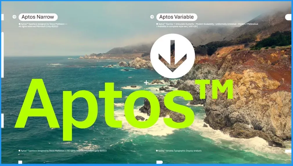
Microsoft commences the final phase of this significant change. Aptos, the new default font, is set to appear across Word, Outlook, PowerPoint, and Excel, delighting hundreds of millions of users. In the coming months, Aptos will gradually become the default font for all Microsoft customers worldwide.
- The below table helps you to show some important notes
| Font Type | Description |
|---|---|
| Cloud Fonts | Available exclusively for Microsoft 365 subscribers, cloud fonts ensure the accurate rendering of documents in Office 2019. |
| Custom Fonts | Users can upload and use their custom fonts. Embedding fonts is recommended to preserve layout integrity when sharing documents with users on older Office versions. |
| Additional Fonts | Provided for document compatibility purposes, including popular open-source, user interface, and rarely used fonts. Listed in font menus when viewing or editing content that utilizes them. |
| True Type Fonts (TTF) | Available individually and as part of True Type Collection (TTC) files. TTC files may contain multiple TTFs. |
| Blocked Access | If cloud fonts cannot be accessed, check if the IT administrator blocks https://fs.microsoft.com. Resolving the blockage may grant access to cloud fonts. |
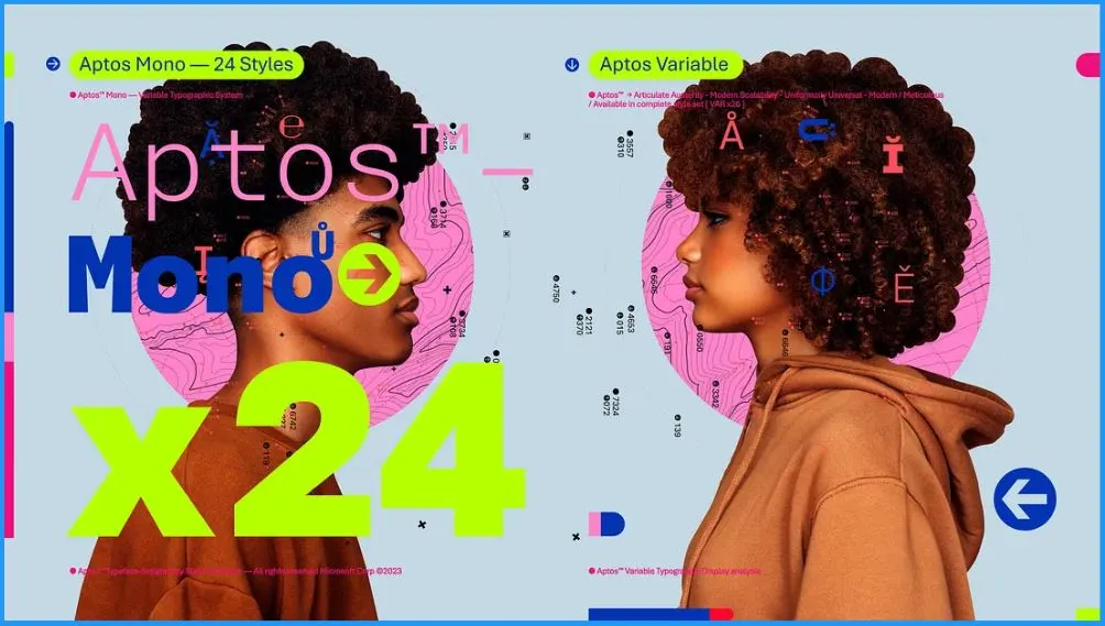
Aptos will roll out to be the default for all Microsoft customers. It was crafted to encompass various aspects of the human experience, making its arrival eagerly anticipated. It is a carefully crafted typeface that balances modernity with a human touch, making it perfect for various applications and users.
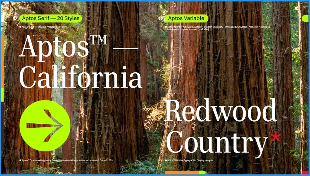
Aptos introduces distinct features to enhance readability. The lowercase ‘l’ now boasts a distinctive tail, distinguishing it from the capital ‘I.’ Additionally, the heads of ‘i’s and ‘j’s take the form of circular dots, departing from the traditional grotesque squares.
- Furthermore, the number ‘6’ is single-stroked, while ‘8’ comprises two piled ellipticals, adding unique touches to the font’s personality.
Five New Fonts
Microsoft’s introduction of five new fonts marks a significant step in its commitment to enhancing the user experience. These fonts bring a fresh perspective to typography, catering to diverse preferences and needs. Adding these five fonts gives users a broader palette of creative tools. The 5 new fonts are as follows.
- Bierstadt
- Grandview
- Seaford
- Skeena
- Tenorite
1. Bierstadt – Aptos Font
Bierstadt is created by Steve Matteson. Bierstadt emerges as a sleek and modern sans-serif typeface. Its precision and versatility make it a perfect choice for various design projects. Its precision and versatility make it a perfect choice for various design projects.

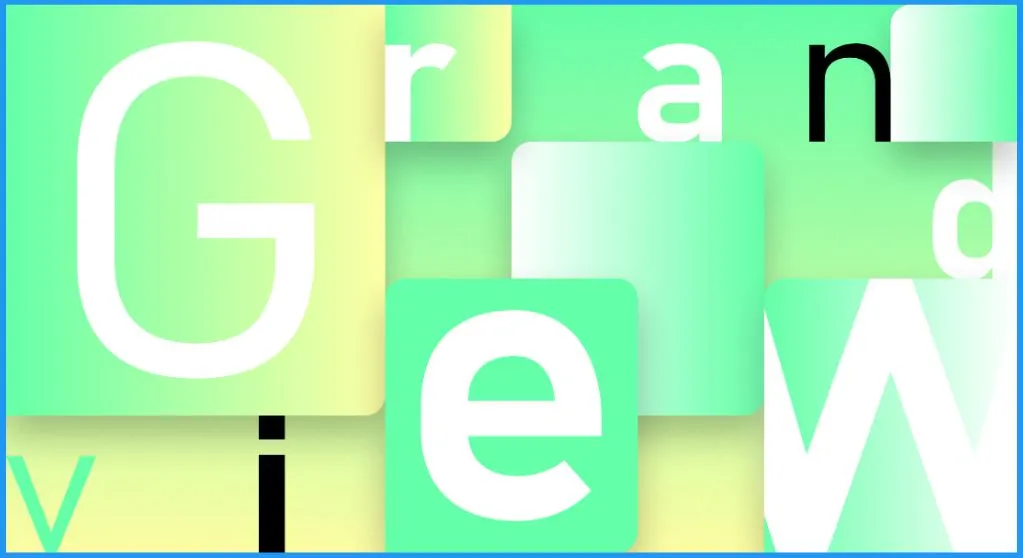
2. Grandview Font
Microsoft introduced Grandview to its font family; users can confidently employ this practical and legible font in various projects, appreciating its reliability and readability at a glance and in prolonged reading sessions. Aaron Bell creates Grandview.
- Grandview, a sans serif typeface with roots in the classic German road and railway signage, is a testament to practicality and legibility under challenging conditions.
3. Seaford Font
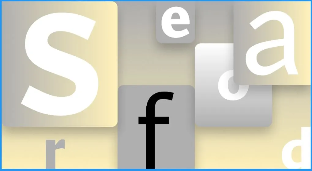
Seaford, a sans serif typeface with a captivating charm, draws its inspiration from the design of old-style serif text typefaces, evoking a sense of cozy familiarity. Its gentle, organic, and slightly asymmetric forms enhance readability.
- By emphasizing the distinctions between letters, Seaford creates more discernible word shapes, contributing to a smoother and more enjoyable reading experience.
4. Skeena
Skeena is part of the Microsoft font family. Skeena proves to be an ideal font choice for a wide range of applications. Skeena, a captivating “humanist” sans serif, draws its inspiration from the graceful shapes of traditional serif text typefaces.
- Its strokes are modulated, with a noticeable contrast between thick and thin and a distinctive slice applied to the ends of many strokes.
5. Tenorite Font
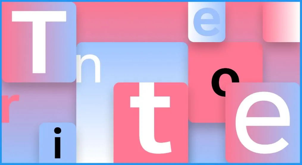
Tenorite embodies the essence of a reliable and versatile workhorse sans serif font, reminiscent of the timeless appeal of fonts like Times New Roman. The font’s warmth and friendliness are accentuated by thoughtful elements, such as larger dots, well-defined accents, and punctuation, ensuring effortless onscreen readability even at small sizes.

Author
About Author – Vidya is a computer enthusiast. She is here to share quick tips and tricks with Windows 11 or Windows 10 users. She loves writing on Windows 11 and related technologies. She is also keen to find solutions and write about day-to-day tech problems.


Hi dear,
How the hell do we change for all office applications to calibri. Its just not possible via intune